Beyond the Numbers: The art of Effective Data Visualization

Data visualization is more than just creating pretty charts and graphs. It’s a way to communicate complex information in a clear and concise manner. Whether you’re working with business data or scientific research, data visualization can help you make sense of your data and tell a compelling story.
In this article, we’ll explore the art of effective data visualization and provide tips and tricks for creating visualizations that communicate your message effectively.
Why data Visualization matters:
In the world of data analysis, data visualization is a game-changer. It has the potential to uncover connections and patterns that are often hidden within data, beyond what’s apparent from just numerical analysis. By employing effective data visualization, you can discover critical trends and patterns, highlight key takeaways, convey complex information in an accessible format, and tell a captivating story that engages your audience. Effective data visualization can help you:
- Unlock hidden trends and patterns in your data
- Highlight critical insights and key takeaways
- Simplify complex information for better comprehension
- Tell a compelling story that captivates your audience
By leveraging the power of effective data visualization, you can make data-driven decisions with ease and communicate critical data in an engaging and memorable way. So why settle for boring numbers when you can have a visual masterpiece that tells a story?
Tips & Tricks to Transform your visualizations:
To create effective data visualizations, you need to consider both the design and the content of your visualization. Here are some tips to help you create compelling and informative visualizations:
- Audience Awareness: Creating Visualizations with Your Audience in Mind:
Imagine you’re designing a billboard — you wouldn’t use the same font size and design elements for an ad targeting teenagers as you would for a retirement home ad. Similarly, understanding your audience is key to creating effective visualizations. Consider who will be viewing your visualization and what information they need to take away from it. Keep it accessible and easy to understand for everyone. - Less is More: The Power of Simple Data Visualization:
In data visualization, less is often more. Avoid overloading your visualization with information or unnecessary design elements. Stick to a simple color palette and use clear, concise labels and titles. Remember, your visualization should be easy to read and understand at a glance. - Choosing the Right Chart:
Different data require different chart types. Consider the message you want to convey and choose the chart type that best communicates that message. Line charts are great for showing trends over time, while bar charts are useful for comparing values across categories. Make sure to pick the chart type that will best tell your data’s story. - Highlighting Key Insights: Making Data Stand Out with Design Elements:
Use design elements such as color, size, and shape to draw attention to the most important data points. Make it clear what insights your audience should take away from your visualization. Remember, effective data visualization is all about communicating the most critical information in a clear and concise way. - Telling a Story with Data: Crafting a Narrative through Visualization:
Don’t just present your data — tell a story with it. Consider the narrative you want to convey and structure your visualization around that narrative. Use design elements to guide your audience through the story and make it clear what insights they should take away. A compelling visualization with a clear story will keep your audience engaged and help them remember the key takeaways.
Visualizing Data Like a Pro: Here are Some Inspiring Examples to Spark Your Creativity
- The State of Wikipedia: This interactive visualization by the Wikimedia Foundation shows real-time information about the status of Wikipedia, including the number of articles, editors, and active users.
Source: https://stats.wikimedia.org/#/all-projects

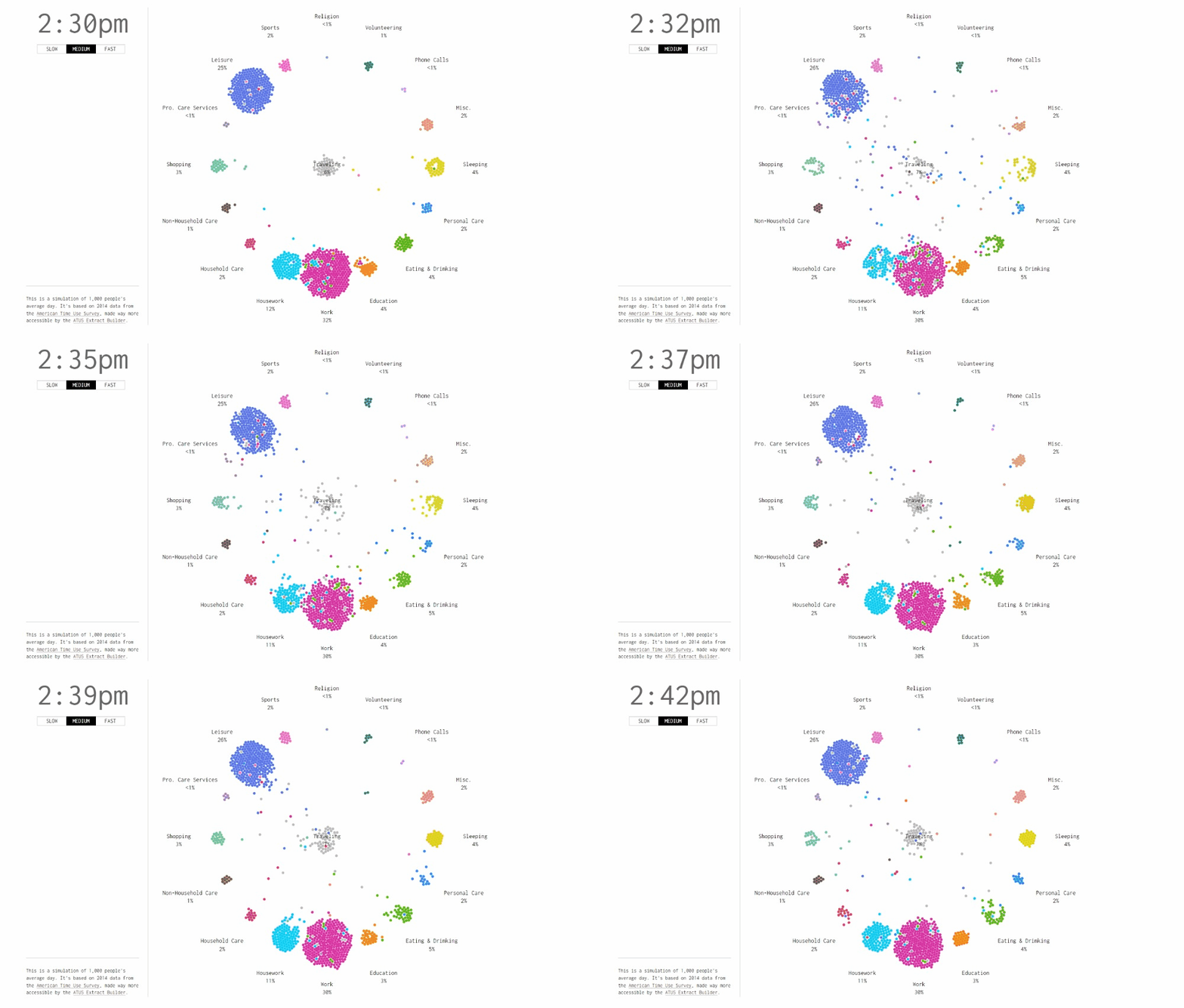
2. A Day in the Life of Americans: This interactive visualization by Flowing Data shows how Americans spend their time throughout the day, based on data from the American Time Use Survey.
Source:https://flowingdata.com/2015/12/15/a-day-in-the-life-of-americans/

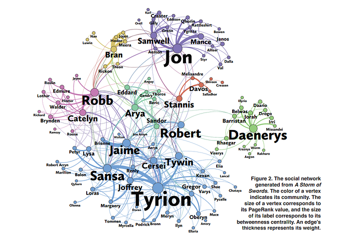
3. The Network of Thrones: This visualization by Andrew Beveridge and Jie Shan uses network analysis to show the relationships between characters in the Game of Thrones television show. The use of design elements such as color and size make it visually appealing, while the clear labeling and layout make it easy to see the most important characters and relationships.
Source:https://www.maa.org/sites/default/files/pdf/Mathhorizons/NetworkofThrones%20%281%29.pdf

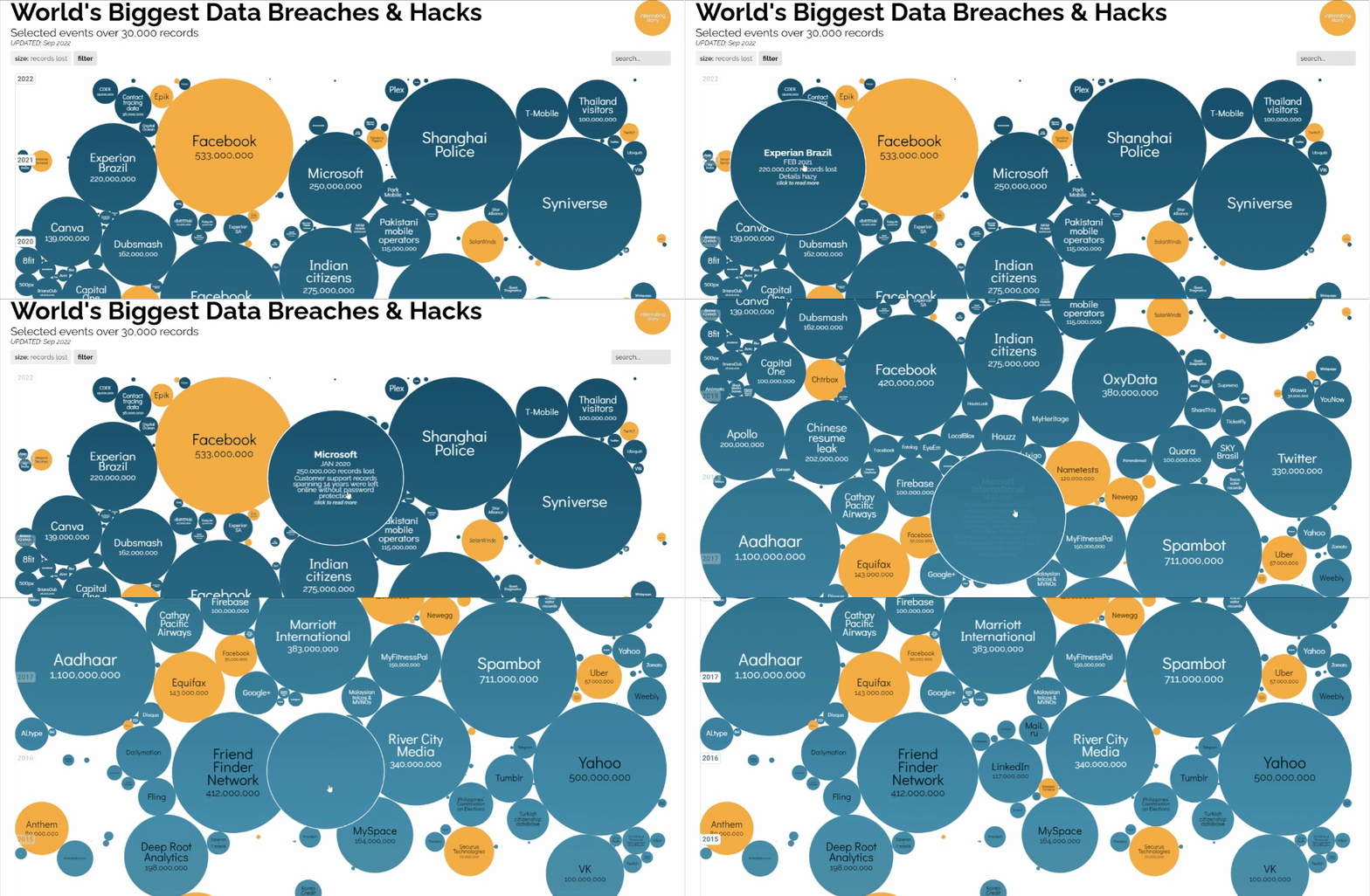
4. The World’s Biggest Data Breaches: This visualization by Information is Beautiful uses an interactive bubble chart to show the size and scope of the world’s biggest data breaches. The use of design elements such as color and size make it visually striking, while the clear labeling and interactive features make it easy to understand the impact of each breach.
Source: https://www.informationisbeautiful.net/visualizations/worlds-biggest-data-breaches-hacks/

Final Thoughts:
In conclusion, data visualization can be your secret weapon to transform boring, complex data into a fascinating story that captivates your audience. By following the tips and tricks outlined in this article, you’ll be well on your way to creating visually stunning and informative data visualizations that not only engage your audience but also convey your message with clarity and impact. So don’t settle for dry, confusing data anymore — let your data speak for itself with the power of effective visualization!
Before you go
I hope you enjoyed reading this article and find it useful. Please consider following me on | GitHub | Linkedin | Kaggle |
Vishnu Viswanath
